I interrupt this story line with a request for help from you the readers.
The second draft of “The Vampyre Blogs – Coming Home” is over halfway done. I’ll be sending it to my proofreader/editor for a good vetting by the end of the month (provided all goes well).
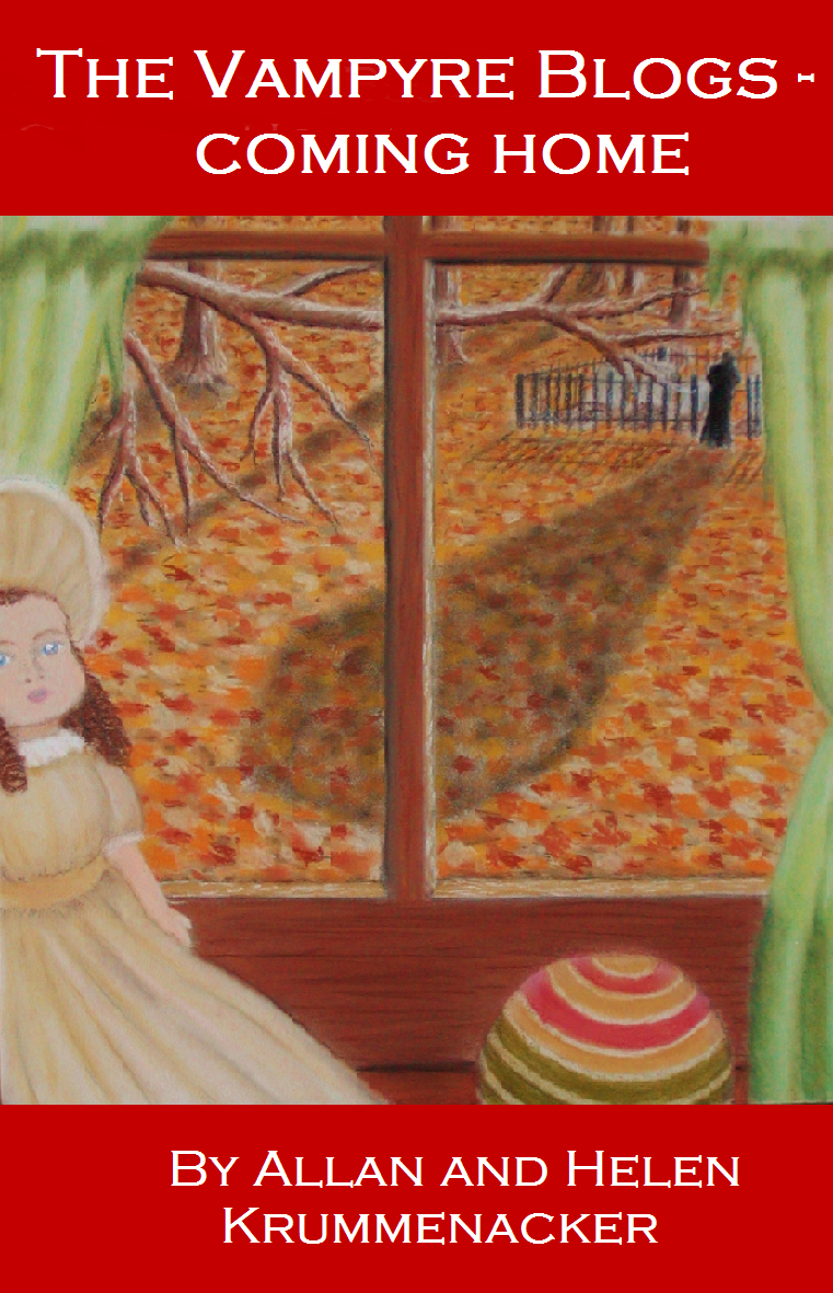
In the meantime, I’m facing a dilemma regarding the book’s cover. I’ve completed the artwork seen here:

As you can tell I did not incorporate the title into the image this time, because I just couldn’t make it work with the scene I’d pictured. I had tried spelling it out in the tree branches but it looked more confusing and hard to read. So I experimented with a letter-box version seen here:
From there I tried black lettering over the image, which I think is a bit hard to read…

Finally I went with white lettering over the image…

For myself, I’ve preferred the red letter-box version since the red helps bring out the colors of the artwork itself.
But I want to hear from you before I make a final decision. Please leave your responses in the comment section below and I will announce the results during the finale of the current short story.
Thanks for all your patience and support. The novel WILL be out this October just in time for you to add it to your spooky Halloween reads.

I like the version with the red box the most. The other two, I find them both to be hard to read, especially from a distance (so imagine a tiny thumbnail, for example). The red boxes on the first one, I also see them and associate them to a picture frame, plus they make the title readable and easy to spot. The only thing I would perhaps suggest is making the red color a different shade, perhaps slightly more attuned to the rest of the image.
Thank you on all fronts. I wasn’t completely sure on the shade of red I used and was thinking of going a little darker to go with the wood and some of the leaves on the ground. Thanks again.
Yes, darker is what I would go for as well, not too much, just a slight hue adjustment.
I hope my input serves you good. 🙂
I’m sure it will, thank you so much.
I like the version with the black font the most. For some reason I don’t like the red one very much. But I’m just downright strange when it comes to red. LOL
Noted. Thanks for voting.